The color purple is often viewed as eccentric and used sparingly. I would like to showcase this hue and the many ways that it can be included in your decor.
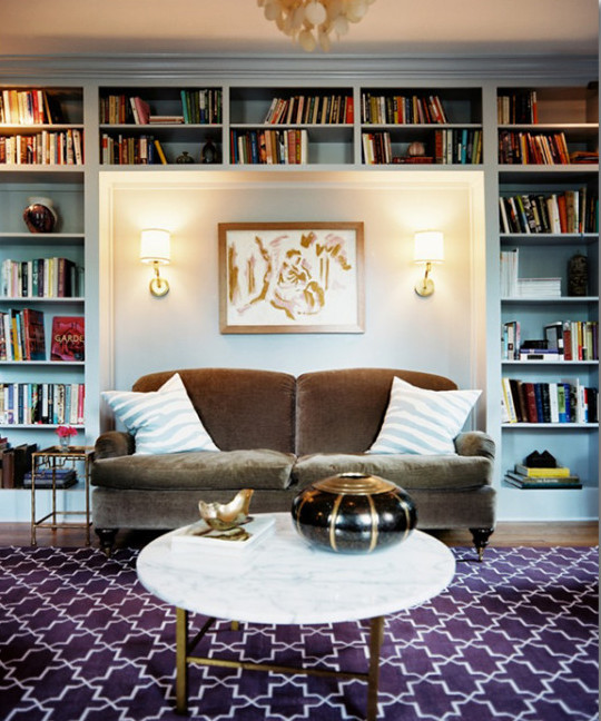
Designed by Angie Hranowsky via Lonny Mag
If you are not feeling very bold or committal towards the color purple, consider adding hints of purple in the form of a new rug. You can go big and purchase a new area rug or simply get a new purple infused welcome mat.
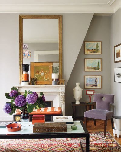
Designer Olivier Gagnère via Apartment Therapy
I love the many colors on display in this design! Surprisingly, the lilac chair tones down the room and adds an overall calmer feel.
Courtesy of Lonny
Courtesy of Lonny
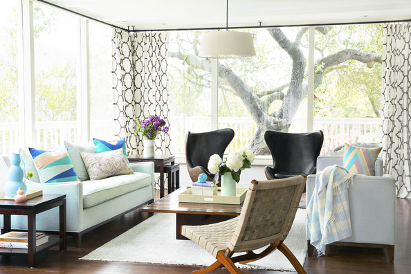
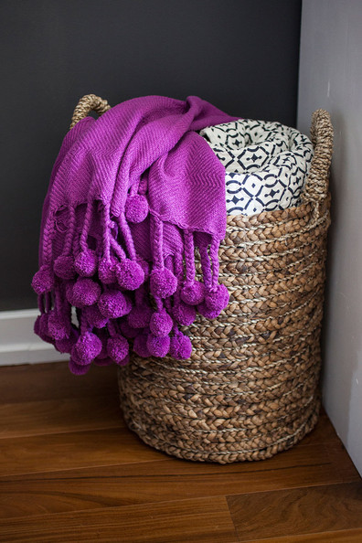
If purple really isn’t your cup of tea, consider decorated with purple flowers and adding a new throw or pillows to spice up a neutral couch.
Courtesy of Apartment Therapy
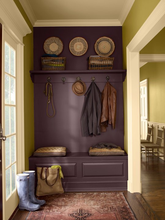
The Benjamin Moore paint color of 2011 was this beautiful Vintage Wine pictured above. This color has enough brown in it to keep it toned down, but the subtle purple hue is beautiful when paired with earth tones.
Courtesy of House Beautiful via Apartment Therapy
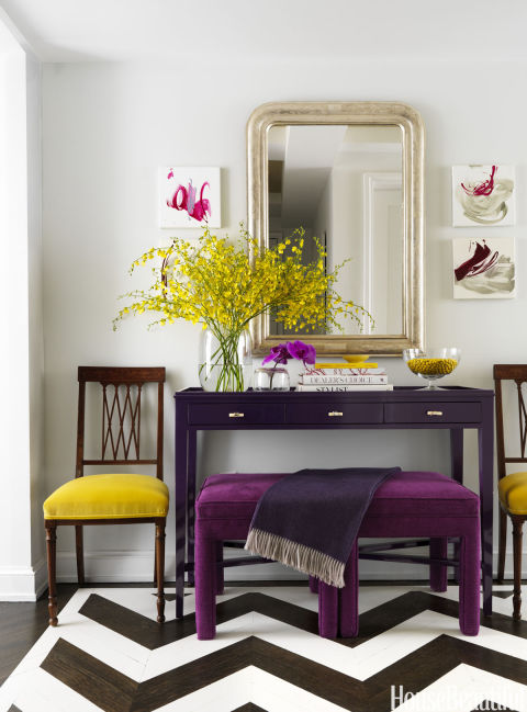
In case you didn’t know, jewel tones are definitely in style at the moment. This design is bolder than the previous designs, but I enjoy the purple color paired with pops of yellow.
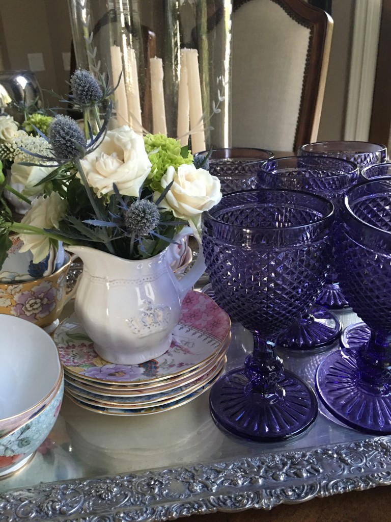
These beautiful purple glasses were the inspiration behind this post. I received these lovely glasses for my birthday and got excited at the thought of writing a post about this color! I hope you feel inspired to step outside of the decorating norms and try adding dashes of purple to your decor!
